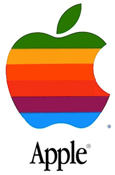
Apple logo mystery
Developing company needs to establish it's distinct identity. Such an identity is typically reflected in the company's logo. There is a text giving deeper insight into ideas and thoughts behind this process.
A past chairman of the Apple Products division is explaining the logo: "Our logo is a great mystery. It is a symbol of pleasure and knowledge, partially eaten away and displaying the colours of the rainbow, but not in the proper order. We couldn't wish for a more fitting logo: pleasure, knowledge, hope and anarchy".
Clearly, the bitten apple refers both to the story of the Tree of Knowledge in the Garden of Eden and to association of IBM with the east coast and the "Big Apple" of New York. The psychedelic mixed-up rainbow (green, yellow, orange, red, violet and blue) signifies the west coast hippie era of the 1960s, with its associations of idealism and 'doing your own thing'. Thus, despite representing a binary opposition to the IBM logo, the multi-colored Apple logo seeks to signify a rejection of the binarism reflected in the 'black-and-white' (or rather monochrome)linearity of IBM logo.
Does your company have logo with the deeper meaning too? Leave here a link, it can be featured in next post!


